【Flutter】カスタマイズできるScrollBarを自作する
概要
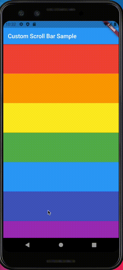
FlutterでListViewやSingleChildScrollViewを利用した際、下記のようにScrollBarWidgetで囲むことでスクロールバーを表示することができます。
  @override
  Widget build(BuildContext context) {
    return Scaffold(
      appBar: AppBar(
        title: Text(widget.title),
      ),
      body: Scrollbar(
        thickness: 20,
        child: ListView.builder(
          itemBuilder: (BuildContext context, int index) {
            return Container(
              height: 100,
              color: colors[index % colors.length],
            );
          },
          itemCount: 10,
        ),
      ),
    );
そのままのScrollBarでも色、太さ、丸みなどのカスタマイズは可能ですが、画面端とのマージンの変更やスクロールバー自体を別のWidgetに置き換えたい場合、ScrollBarでは実現できません。
上記のような要件を実現するために、今回はScrollBarを使用せずにScrollableなWidgetに追従するCustomScrollBarを自作してみます。
開発環境
| Tool | Version |
|---|---|
| macOS | 11.4 |
| Visual Studio Code | 1.58.0 |
| Flutter | 2.2.3 |
| Dart | 2.13.4 |
前提
下記のようなScrollableなWidgetがあること。
  @override
  Widget build(BuildContext context) {
    return Scaffold(
      appBar: AppBar(
        title: Text(widget.title),
      ),
      body: ListView.builder(
        itemBuilder: (BuildContext context, int index) {
          return Container(
            height: 100,
            color: colors[index % colors.length],
          );
        },
        itemCount: 10,
      ),
    );
  }
実装
まずはスクロールに追従しないBarを表示するところから始めます。
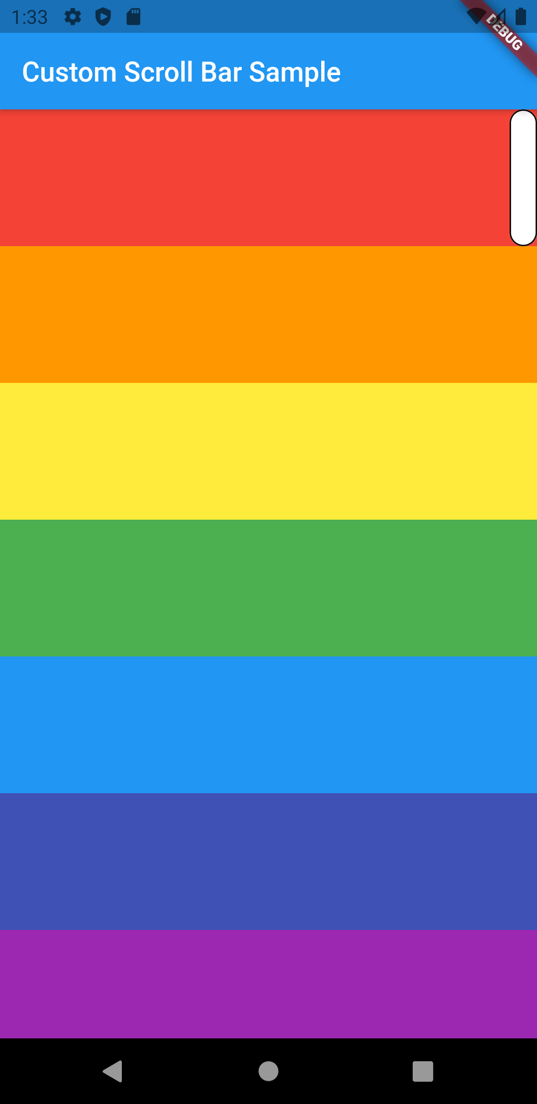
画面右端に表示される縦長のStatefulWidgetを作成します。
import 'package:flutter/material.dart';

import 'constants.dart';

class CustomScrollBar extends StatefulWidget {
  const CustomScrollBar();
  @override
  _CustomScrollBarState createState() => _CustomScrollBarState();
}

class _CustomScrollBarState extends State<CustomScrollBar> {
  @override
  Widget build(BuildContext context) {
    return Align(
      alignment: Alignment(1.0, -1.0),
      child: Container(
        width: 20,
        height: 100,
        child: Container(
          decoration: BoxDecoration(
            color: Colors.white,
            border: Border.all(color: Colors.black),
            borderRadius: BorderRadius.all(
              Radius.circular(custom_scroll_bar_radius),
            ),
          ),
        ),
      ),
    );
  }
}
上記をListViewにStackで重ねてみると下記のようになります。
次に、ListViewのスクロールに合わせてCustomScrollBarが動くようにします。
ListViewに適用したScrollControllerをCustomScrollBarに引数として渡し、
ScrollControllerの状態に合わせてCustomScrollBarのAlignmentを変更していきます。
  /// CustomScrollBarの位置(Y軸)
  /// topが-1.0、bottomが1.0
  double _alignmentY = -1.0;

  @override
  void initState() {
    // スクロールの動きを検知するリスナーを設定
    widget.scrollController.addListener(_scrollingListener);

    super.initState();
  }

  @override
  Widget build(BuildContext context) {
    return Align(
      alignment: Alignment(1.0, _alignmentY),
      child: Container(
        width: 20,
        height: 100,
        child: Container(
          decoration: BoxDecoration(
            color: Colors.white,
            border: Border.all(color: Colors.black),
            borderRadius: BorderRadius.all(
              Radius.circular(custom_scroll_bar_radius),
            ),
          ),
        ),
      ),
    );
  }

  /// スクロールの動きを検知する
  void _scrollingListener() {
    setState(() {
      // スクロール位置
      final position = widget.scrollController.position;
      // スクロール領域に対する現在の位置の比率
      final ratio = position.pixels / position.maxScrollExtent;
      // スクロール位置に対するScrollBarのAlignmentを設定
      _alignmentY = ratio * 2 - 1;
    });
  }
これでスクロールの動きに追従するScrollBarが実装できました。

あとはCustomScrollBar内でPaddingを設定したり、Barを画像にしたりと色々とカスタマイズすることができますし、既存のScrollBarにあるスクロールしない間は表示しないようにすることもTimerなどを使えば実現できますね。

まとめ
今回はScrollBarを使用せずにScrollableなWidgetに追従するCustomScrollBarを自作してみました。
これでデザイナーさんからのあらゆる要望に答えられるスクロールバーを実装することができますね。
もし自由にカスタマイズできるスクロールバーを求めている方がいたら参考になれば嬉しいです。